StartingPoint is a modern online based banking app that helps students and graduates develop a better understanding and insight of different types of accounts and offer overall financial advice
Demographic: 16-24
I was the sole member of this project, the research, paper designs, and digital designs were all done by me and corrected with the feedback of my tutor and my peers
Module: Interaction Design 103 - Exploring Identity
Duration of project: 12 Weeks
Research
I conducted research to find what out what the key features users want in their banking app; this research was done based on people of the 16-25 and through tis I developed the empathy which I then applied in my product. I asked a few classmates about what their ideal banking app would involve, the majority had the same thoughts, and this is what stood out the most:
-A banking app that doesn’t require a card reader when adding a payee onto their app to transfer money.
-An intuitive app that is easy to use, one that isn’t only befitting of the target audience but one that will also be easy for the elderly to use
-An app that allows user to track their spending and income and gives advice on money usage, savings, and future investments
In order to get more insight of what my target audiences’ experience is with their current online banking apps and what features they’d like add to their app, I had to do a survey, this survey form was sent to my peers and others.
Brand Development
After conducting research and knowing the needs of my demographic I decided to come up with the core values for my bank, this was done by doing a mind map and thinking of words that I want the bank to be associated with, these words are also reassuring and make the audience put their trust in the product.
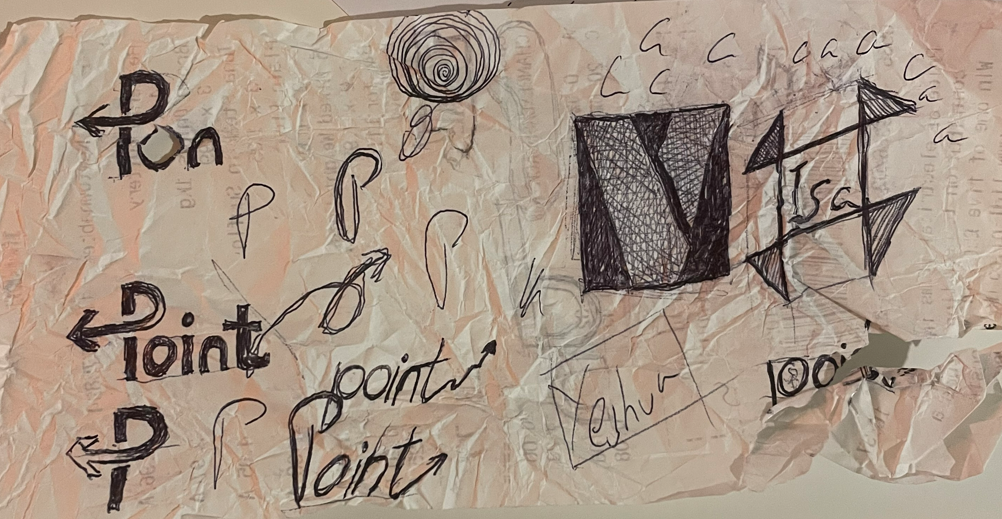
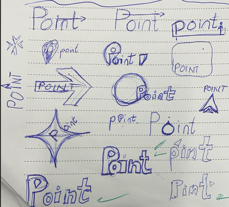
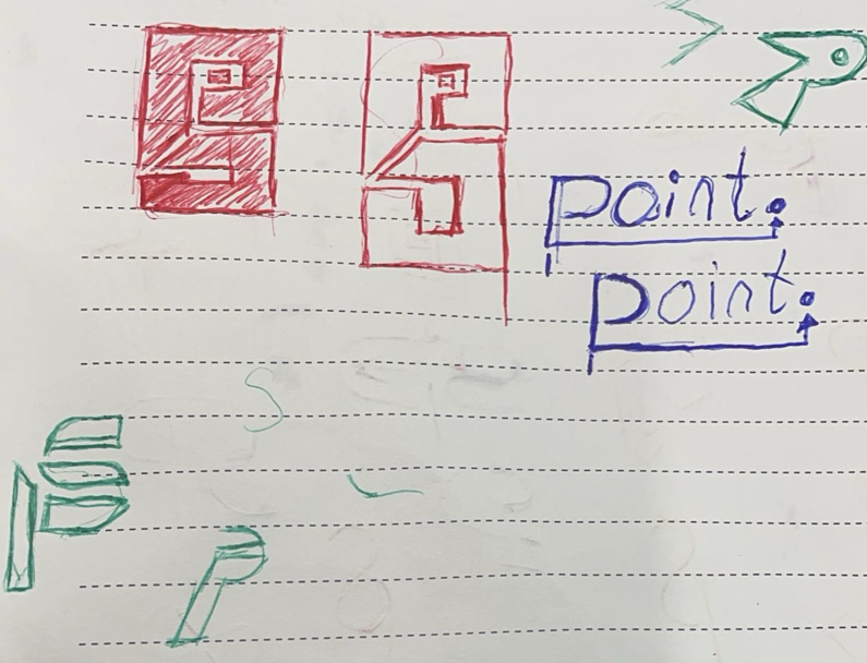
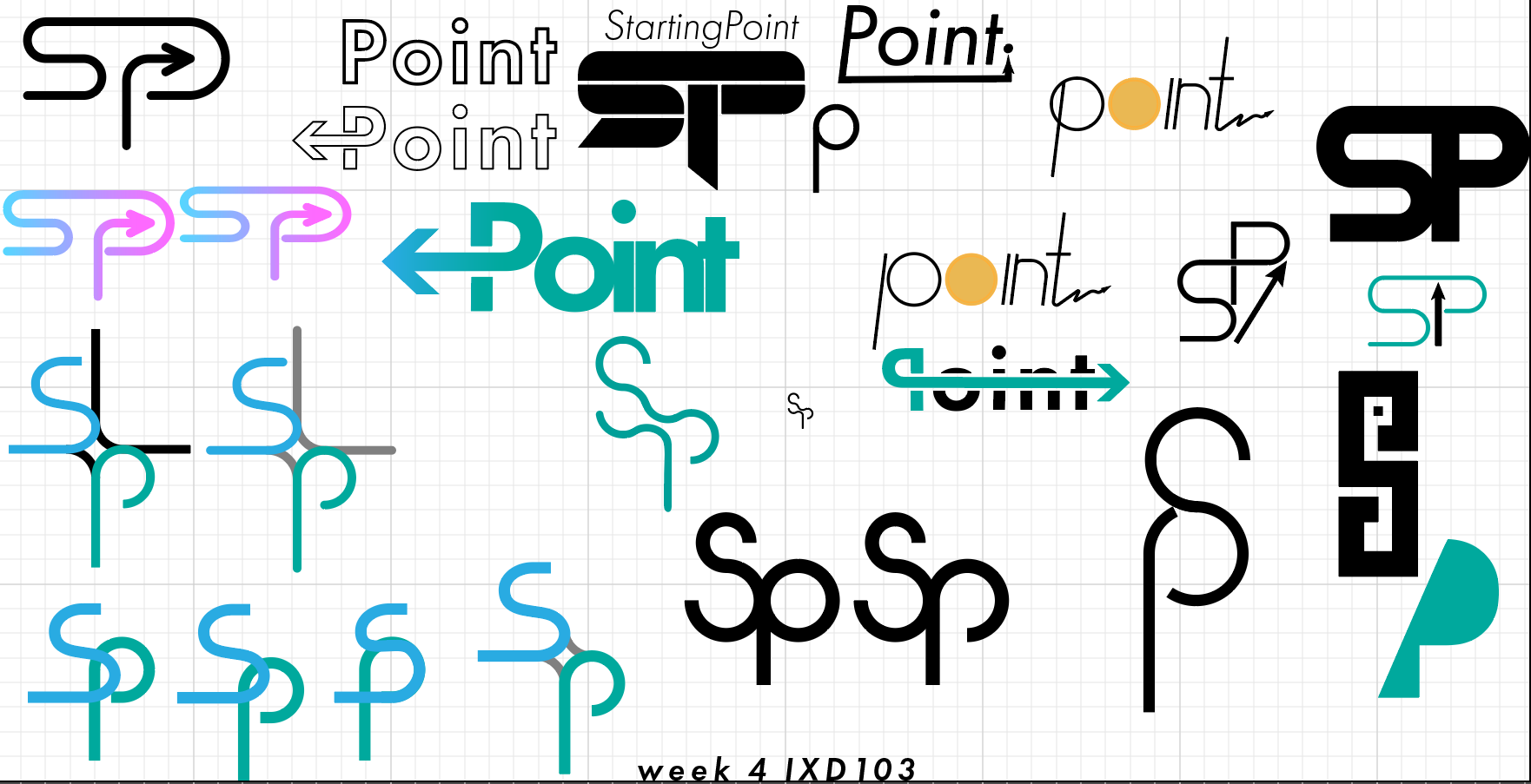
The core values helped me pick a name for my banking app. I then did a few sketches of wordmarks with the name of my bank "StartingPoint" in mind, and the the wordmark that I eventually decided to develop on was actually sketched behind a receipt paper that was on my dinner table. I jumped on Illustrator and started the digital development of my wordmark and I eventually came up with one with the help of feedback I gathered from my peers.
Core Values: YOUTHFUL, RELIABLE, TRUSTWORTHY, INNOVATIVE, and SUPPORTIVE
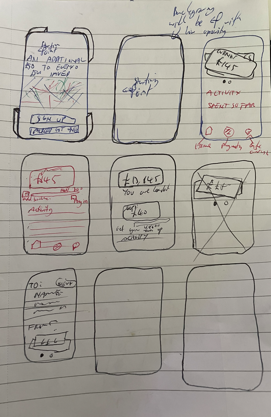

Brand Rollout
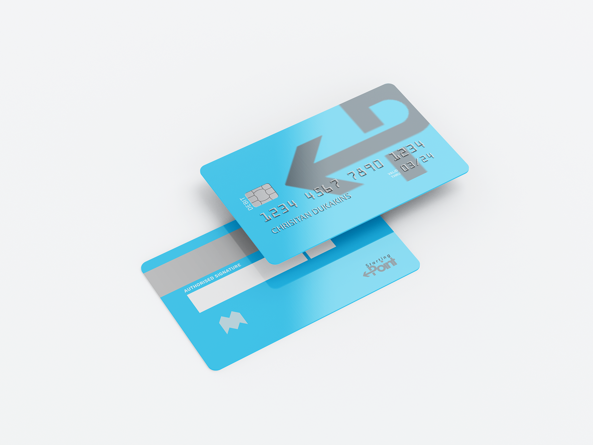
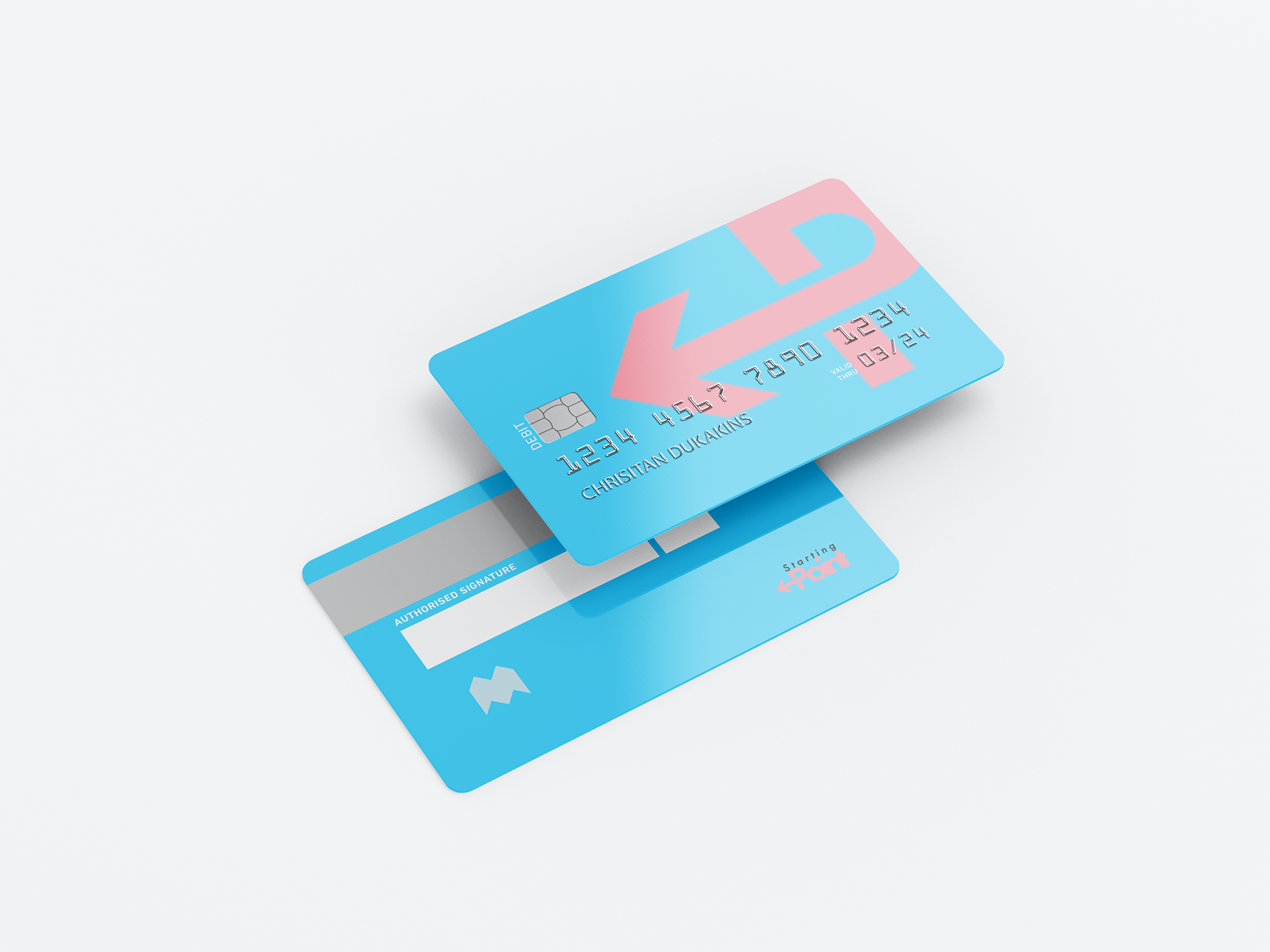
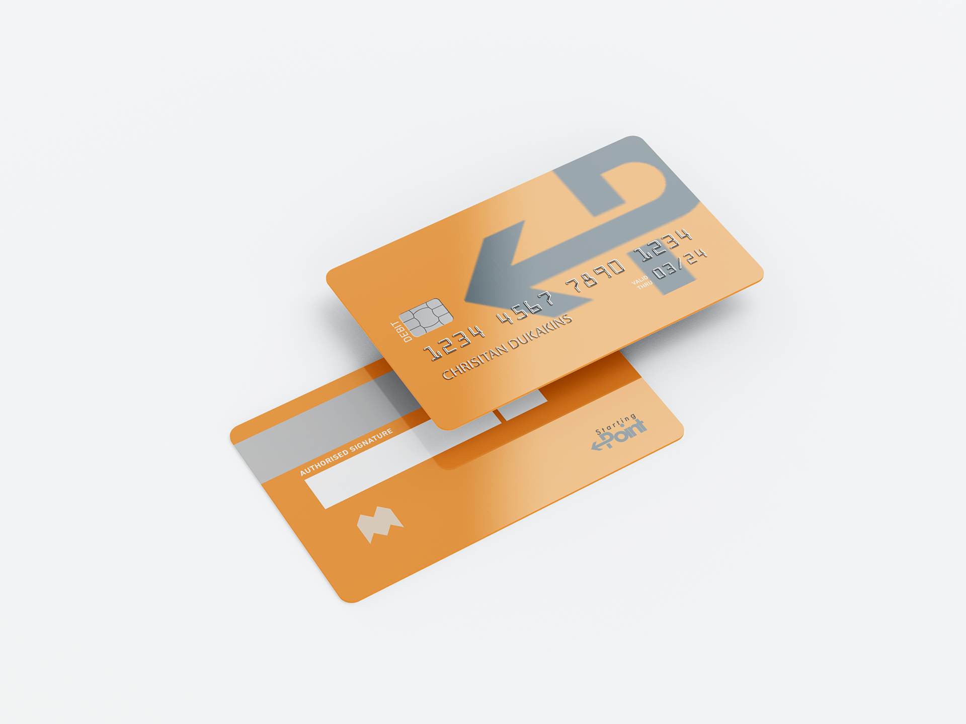
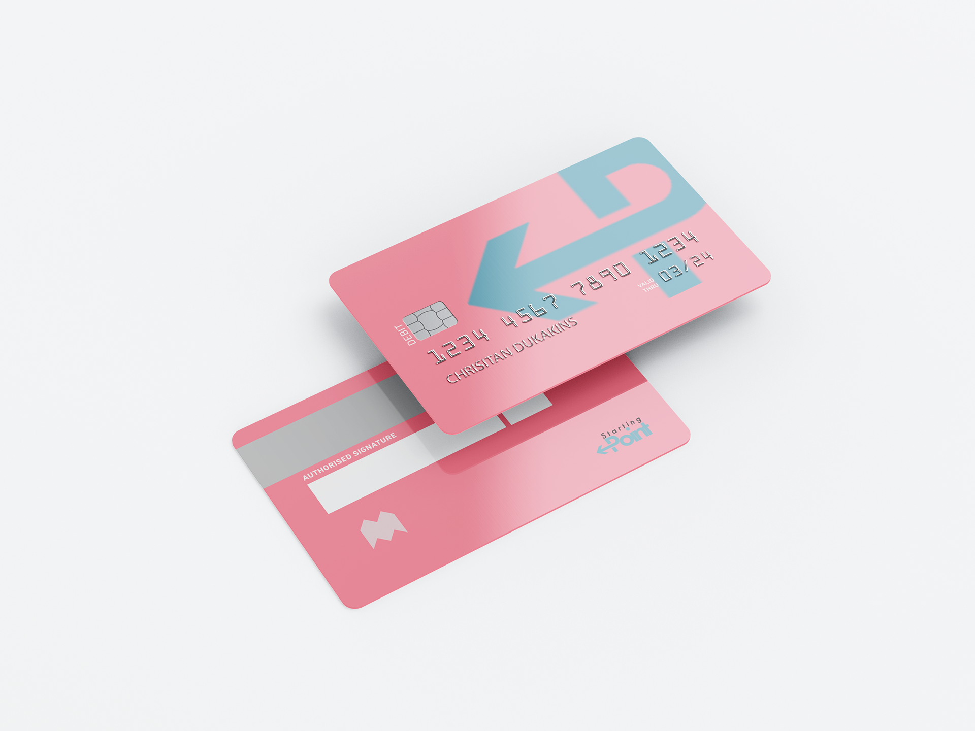
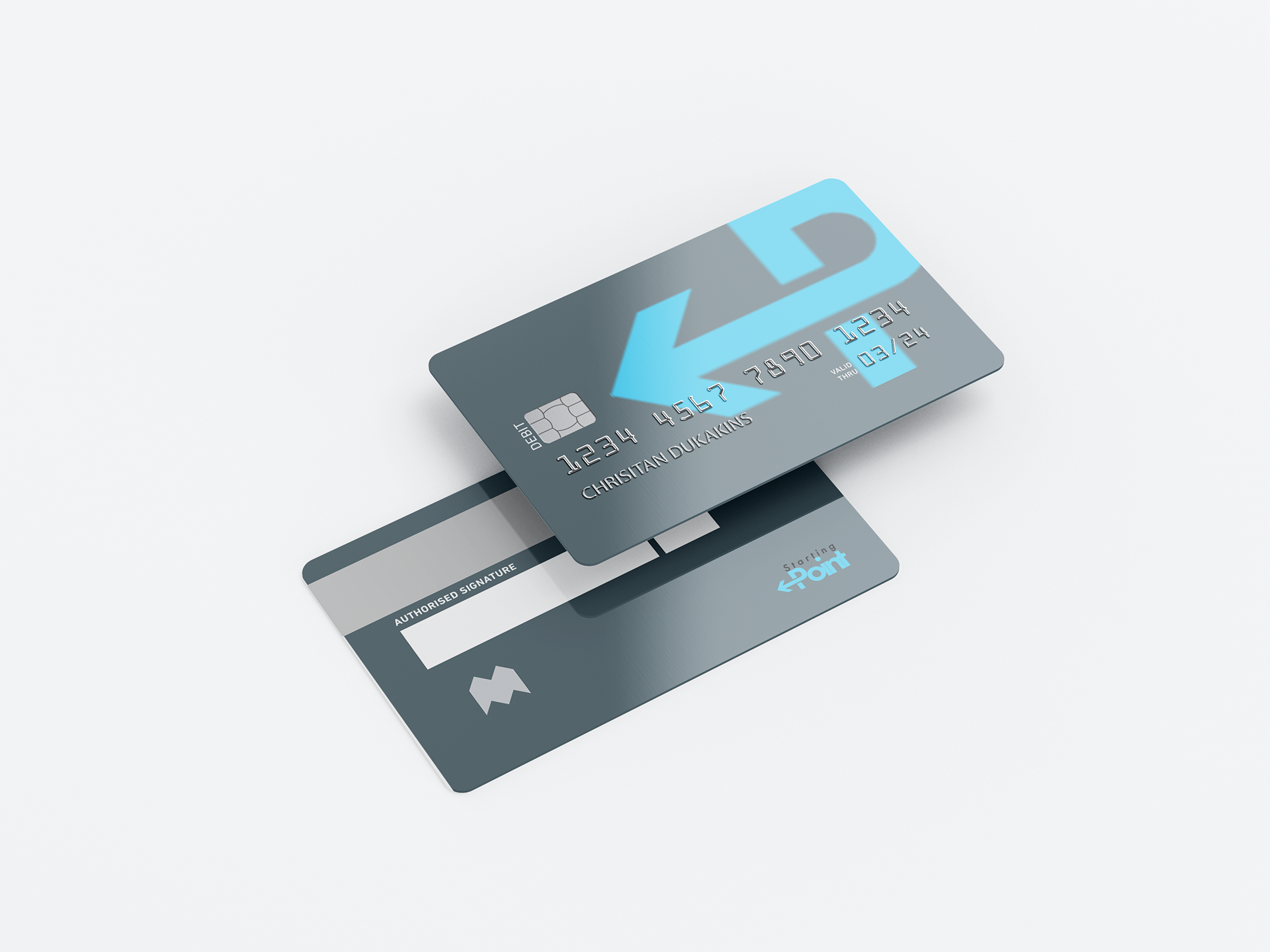
When it was time to come out with rollouts I decided to explore and investigate what the bank's logo would be suitable on, and since it's a bank I went ahead and explored what ahead and explored what my wordmark would look like in different colours. I also decided to do a mock up of a banner with line patterns that signify fast transactions, the reason why I chose a banner was because I thought it would work really well in a a college or university hall since such places have a high concentration of my demographic.

Banking App
Landing Page
Brand Guidelines
Reflection
I have learned a lot about the importance of user experience and interface design. I realized that creating a seamless and intuitive user experience can significantly impact the app's success. I loved learning how to use the interactions and flows on Figma when I was creating my banking app, I did come across some complications such as things being laid out wrongly on different screens.
Overall, I really enjoyed this module with its ups and down, I feel very confident in my UI/UX design skills now. In this project I was not confident in using components but I will make sure to learn more about them so I can confidently implement them in my future projects. I’m looking forward to applying what I’ve learned to any future projects, I’m proud of the banking app that I made and I loved every bit of the banking app creation as it gave me an insight on how a brand is created.