LifeStride is a data gathering app that accumulates and curates data collected over the span of a week. All the data is then visually displayed on a dashboard.
Despite it not being one of the main projects I did in my first year I enjoyed it very much, from the data collection to the wireframes. What I discovered is that I like collecting and organizing data in a visual manner that makes it easy to understand.
Interaction Design 104 - Imaging and Data Visualisation
Duration of Project: 6 Weeks
Data Collection
For over a week I collected some data that are relevant to me. I tracked my movement via my black box app, this helped a lot as not only does it track my driving performance but also the distance driven and the duration of the journey, another data that I enjoyed tracking was my calories, this one was quite easy since I like to track my calories on the daily basis. The whole process of data collection was very interesting and fun. Working on this project made me realize how much I enjoy collecting data.
Sketching
The next step in the project was to sketch out the wireframes of the dashboard I had in mind. I looked on Pinterest for some colour and layout inspiration and after doing so I proceed to do some rough sketches of what I wanted some of my main screens to look like because these screens will probably have the most data
Digital Development
At the beginning of the digital development phase I decided to build my side bar with all the screens. I then laid out how I wanted my data to be presented. This process was very fun as it helped me have an idea of how I wanted my animations to be.
All gathered data that was organized on Microsoft Excel was then traced using Adobe Illustrator and some were traced on Figma.
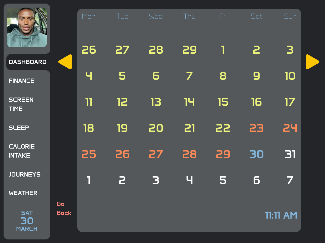
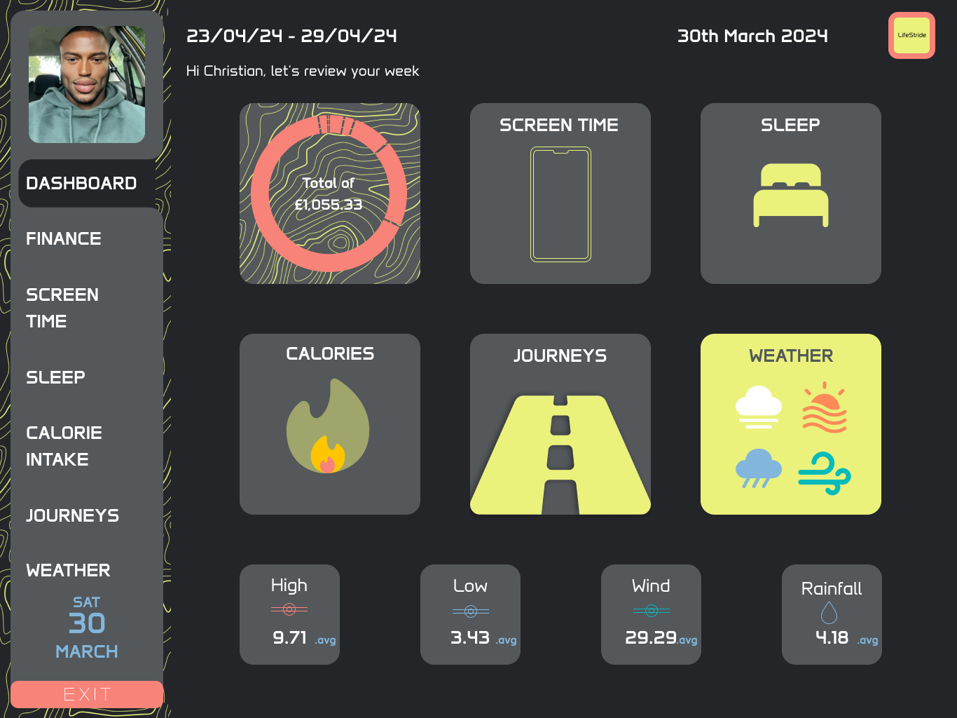
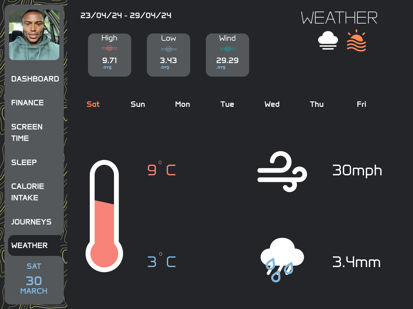
During the creation process of my dashboard I remembered to run a contrast check on all my screens because I wanted to ensure an accessible interface
Dashboard Screens
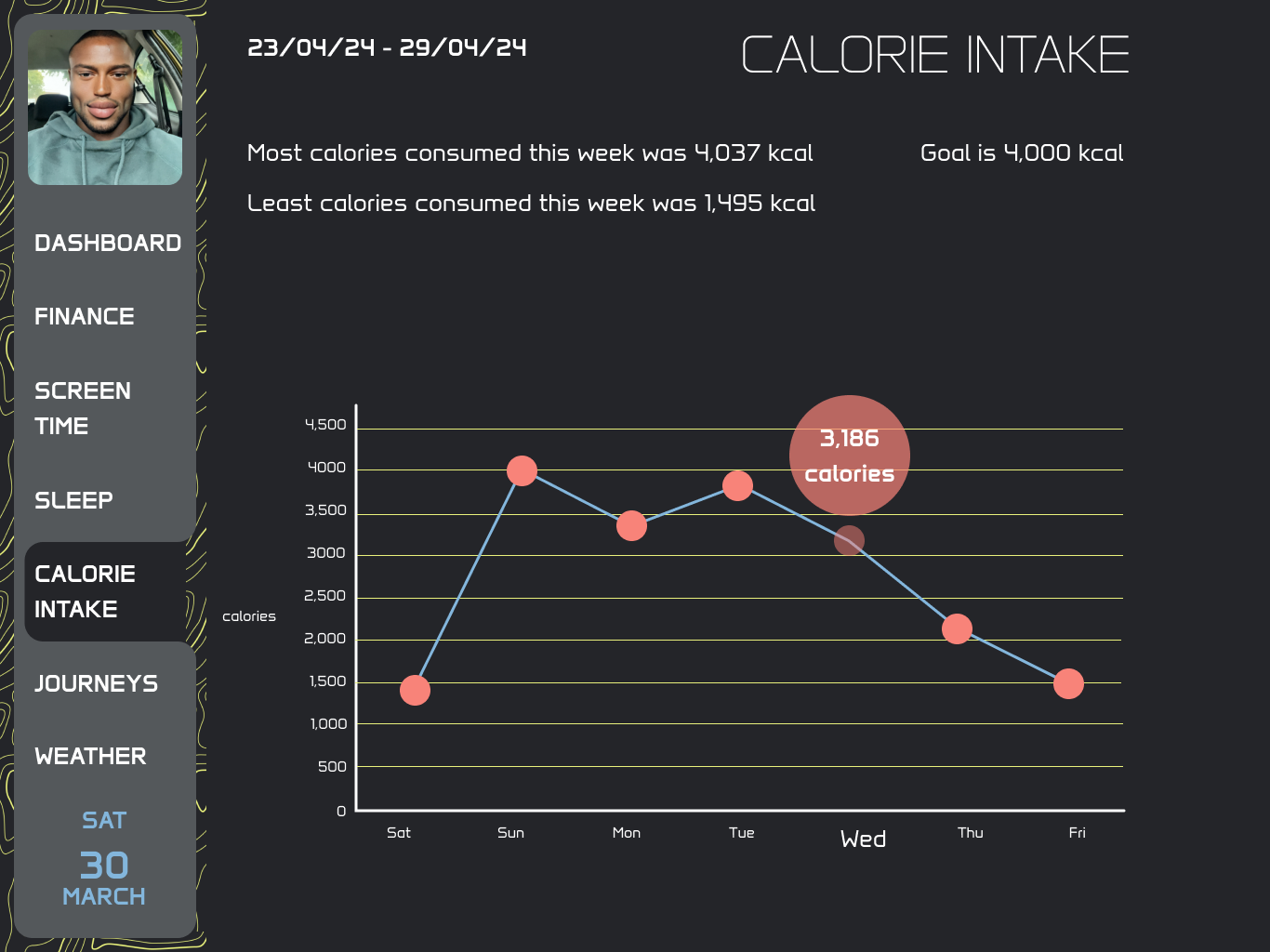
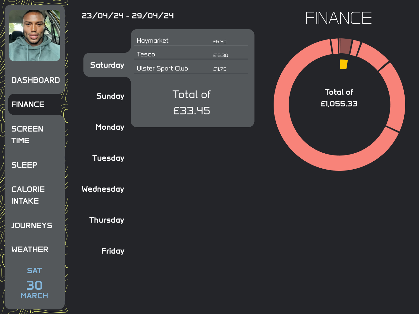
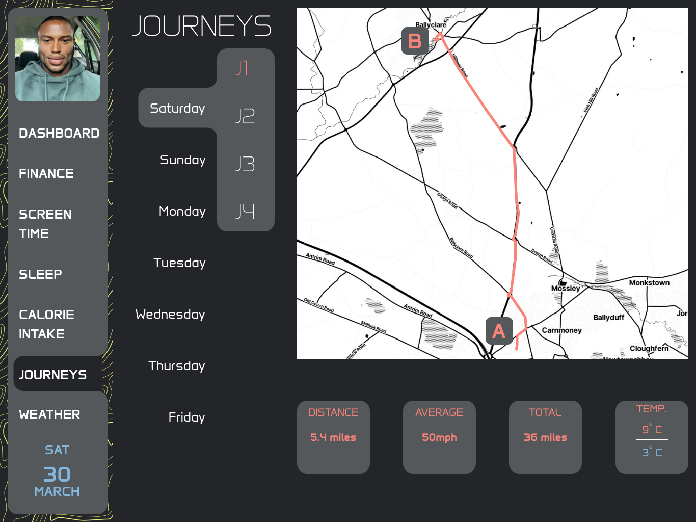
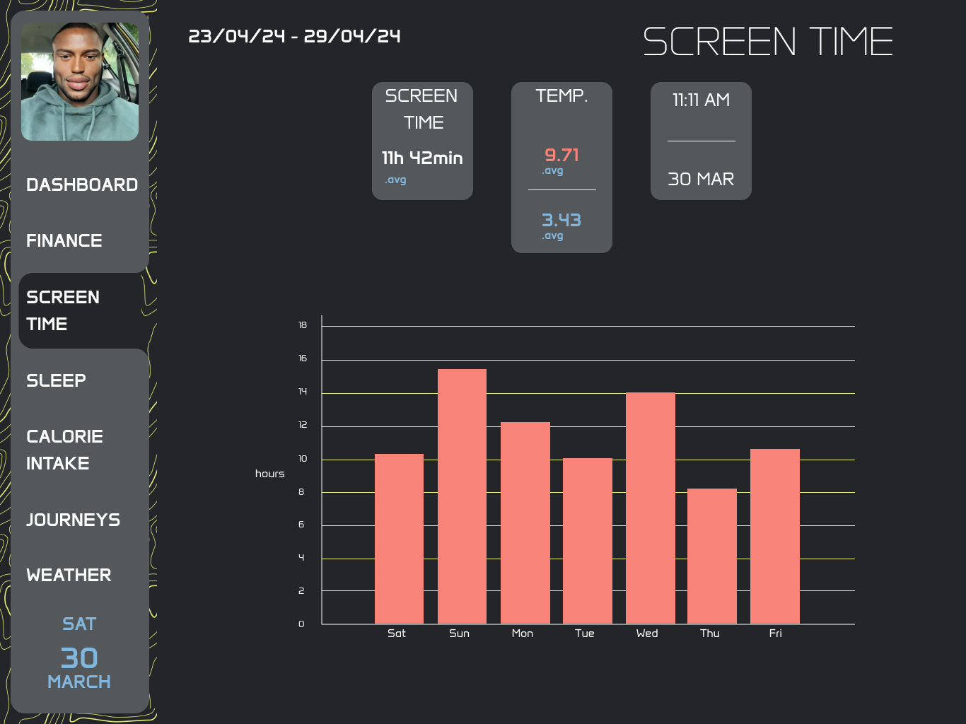


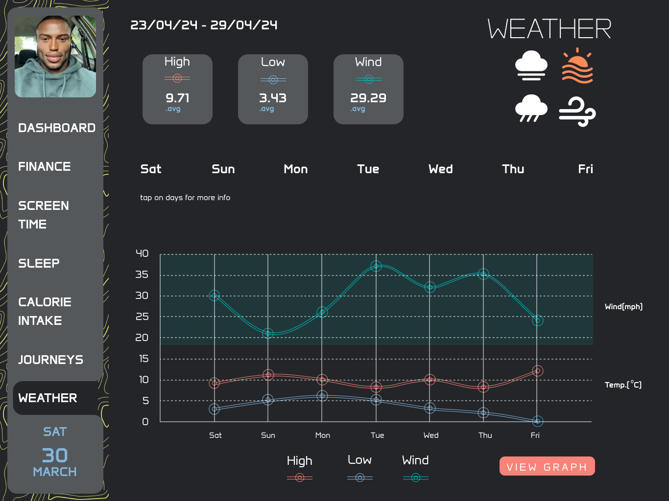
Prototyping the entire dashboard was very fun. I was very comprehensive in the prototyping phase of my project. The music app and a banking app projects I did along the way built my Figma proficiency and confidence hence I felt very comfortable going into depth with all the interactions and animations
Reflection
Even though this wasn’t the main project in the this module I very much enjoyed, I don’t know if it was stress that was exciting me but I loved making this dashboard and I am very happy with how it turned out. I pushed myself to the limit with this one and applied all Figma my skills and knowledge to this project. There wasn’t a single aspect of it that I didn’t enjoy even though we had about 2 weeks to create it. I poured a lot into this and tried my best to ensure that everything on the screens that could be interactive became interactive, making it feel more than a prototype. I’d say this is my best Figma work so far and I am looking forward to learning more and applying it in my second year projects.